
June 17th
I think this entry is mostly self-explanatory.

I hate cleaning screens.


This series was really painless. It was refreshing to have no-fuss registration.
May 27th- another edition, more experiments with registration correction
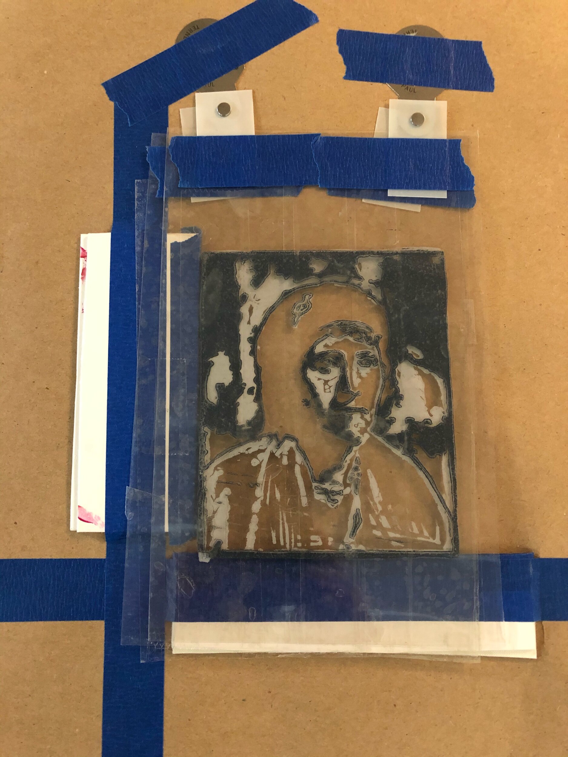
If I print each plate onto clear plastic using the same reference guides I can create independent references that show the relationship and variation between each image’s registration.

It took me quite some time to wrap my brain around this. The process is to print each image onto clear plastic. I can then tape all 3 images together with the best image overlay. This gives me a method to reference the registration difference each plate’s will need to give me the desired overlay. It’s a way to establish the spatial relationship and registration difference each image might have.
After I tape my transparent reference ‘keys’ together I locate the first image tabs on the registration pins, tape all of the keys to my table so they are entirely stationary, then move the registration tabs to the next image I want to print.

It’s kind of like saying, “If this image prints here, and the next one registers there, then I need to move my registration pins to there.”

It’s very much like a machining process to setup part origins using Cartesian coordinates. This is all about establishing a spatial relationship between features and compensating for the locational differences.
If I need to put a hole in the center of a 1 x 1 block and a hole in a 2x2 block I need to compensate for the extra material so the feature is still in the block’s center. If the hole is always created from a stationary point then I need to move the larger block and extra .5 to line up the hole with the center.

May 24th
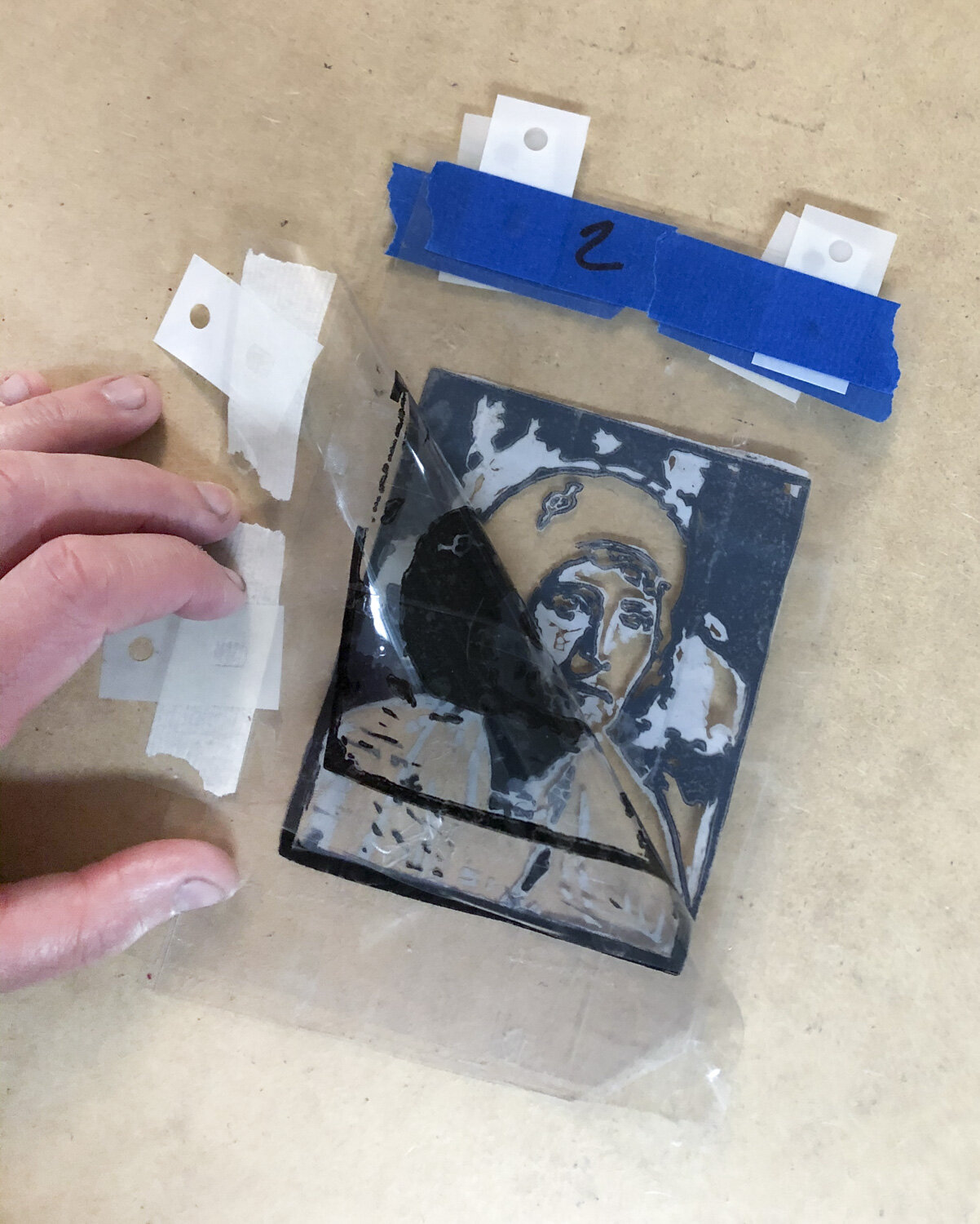
I had success correcting the registration of my light and dark grey from this print. Here are a few images that detail the process of correcting the mis-registration with pins and tabs. it’s really just a process of finding where each image prints, the adjusting the registration pins accordingly based on that relationship.
I had success taping the two transparencies together, locating off one image, then moving the pins to the location of the second image.


May 8th
I don’t have a lot to report- I just finished printing this edition and prepped for the next couple. I really like how these look on the brown butcher paper.
It occurred to me I’m going to be doing a lot of chine colle at some point.

May 1st
Here’s some random thoughts from recent work. The main issue I had with the below image was their registration was off. To try and trouble shoot the problem I printed the each linoleum plate onto clear plastic, using the same registration tab spacing. By lining up the two clear sheets I could then compare how the registration tabs were misaligned and make adjustments accordingly.
I was wondering if i print onto clear plastic and then tape the two pieces together if I could manage to move the registration pins in a more precise and systematic way.
The process might go like this:
-Print both inks onto 2 pieces of clear plastic using same registration tab spacing.
-Tape both pieces of plastic together with proper image overlay and registration
-Attach 1st color registration tabs to pins, then fix plastic to backing sheet
-Retape pins to location of 2nd plate’s tabs
I had a hard time wrapping my brain around it but I think with some practice it will probably get easier.

I recycled some watercolor transparencies from a CMYK FOOD positive of chinese food on paper plates. You can see the chop sticks, egg roll, and paper plate patter.

I took a week off after printing to 1st plate so the gray ink had almost 2 weeks to dry. I a difference in how the ink on the second print was taken by the paper. I think it’s noticeable in the crisp ink lines.
Recent Work (April 12th, 2020)
I made some nice progress

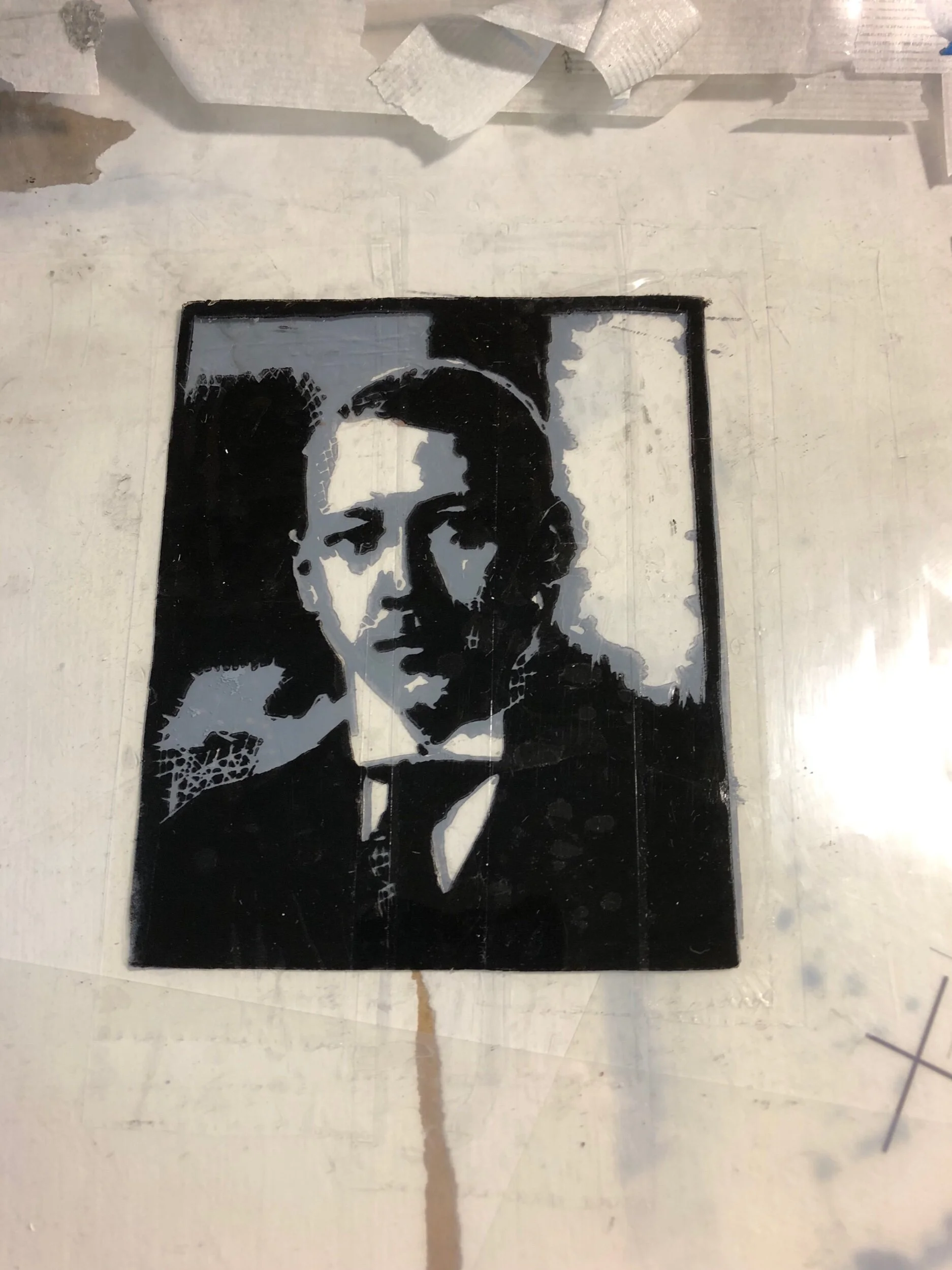
I like how the cut areas printed but I did have to recut areas on his forehead to make sure they weren’t inked. There were a few spots that still would collect ink but it was a vast improvement over my initial work.

I’m really happy with the consistency and clarity of these images. For these I printed the grey first and let them dry for a week before printing the black on top. This edition will be 15 print. I did have a couple that I discarded because they deviated too much from my desired image. The main problem I had was over- inking- you could see how the excess black ink squished out from under the linoleum and create blurred and double lines. It was both subtle and obvious.
The registration tabs worked like a charm however.
Graphic Design Challenge:
Recreate a design from a photocopy of a photocopy of a photocopy

This was the image I was provided. It’s a patch that was sewn onto a uniform. I was tasked with recreating this image and prepping it onto a silkscreen so it could be screen printed.

Here is the final image. The main problem I had was deciding how to handle the talons. The source image really didn’t give me much to go from so I researched other Aviation and bird imagery and tried to decide what would work best in this context.
Dispatches from the frontlines
I also had a lot of success using registration tabs and plate fixture. Previously I was outlining the plate on a hinged registration sheet which I made and attached to each print separately. Although it wasn’t the most precise method, I was still able to achieve good results. Registration tabs and pins seems to be incredibly easier since I won’t have to line up the print and plate each time. They also give a higher degree of accuracy that I wasn’t getting before.


I spent some time continuing to experiment with Kozo for my relief prints. I appreciate the crispness my prints seem to attain from this paper. It seems to absorb the ink very well. I used rice paste to chine colle the Kozo onto a heaver paper with success. I’m really impressed how well the richer cream color of the thicker paper shows through the thinner Kozo.
Paper testing.
I spent some time testing different papers this weekend. Kozo, the paper used in the 2nd image, worked considerably well. It seemed to absorb the ink more quickly and evenly. It doesn’t look like ink was collecting around the edges of the relief.


Lino cut works in progress
I’ve been spending the past week revisiting some older linocuts and would like to edition them before putting them to bed. Completing some older projects seemed like a great way to get started this year.
Most of them are 2-3 color images printed in greyscale. Here are a few previews. I’ll post more after my next printing session.


[.WIP.]


[peep.show.]@[Black.Earth.Gallery]
What an amazing collection of art from incredibly geographically diverse group of amazing artists! I'm glad this silkscreen was accepted- especially since I made it specifically for this show, which was themed on "peep shows". This was created from vintage pinups, digital drawn, and screen printed.
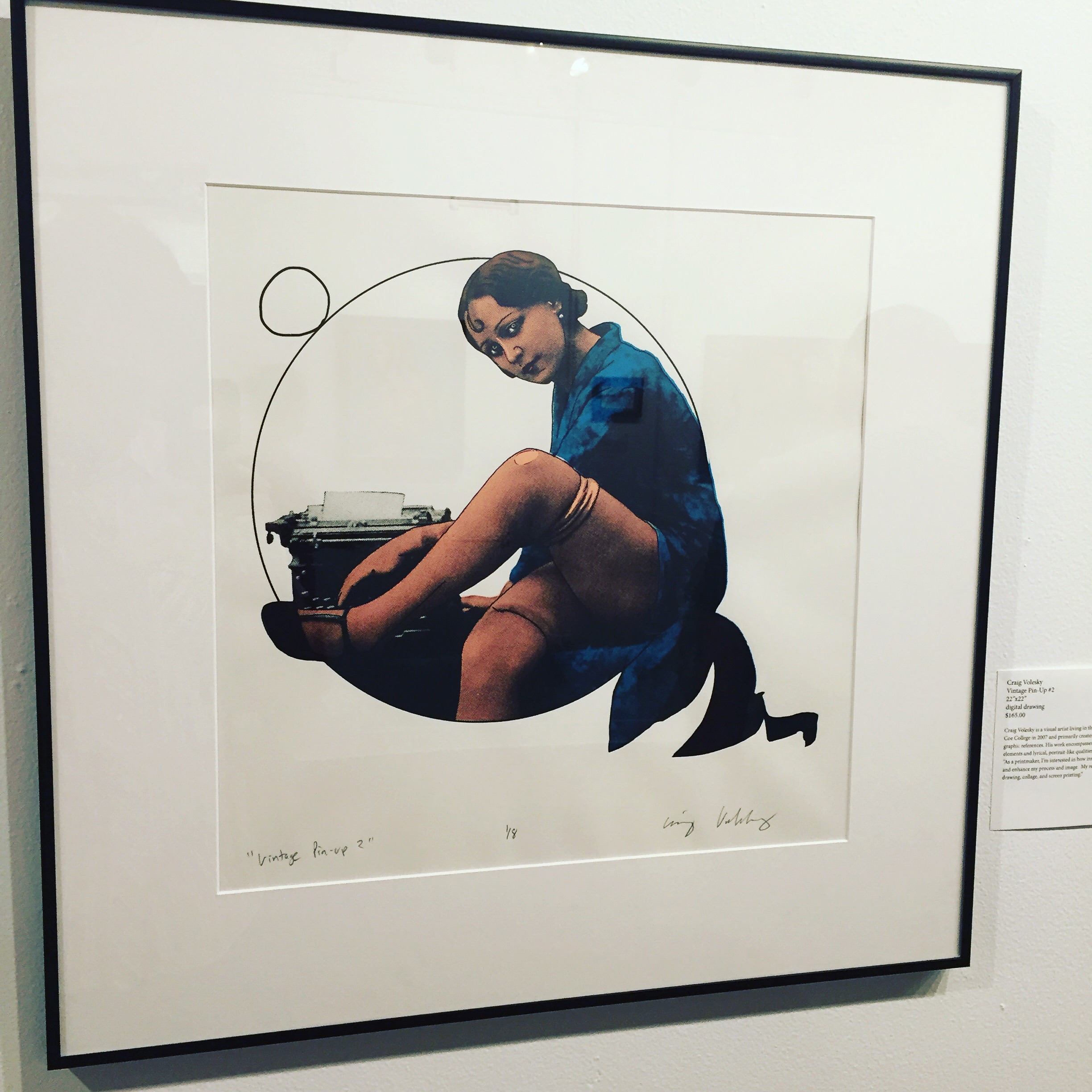
"Vintage pinup #2," 14x14, digital drawing and silkscreen.
[.NEW.][!!!!]
I'm pretty excited about this one. It's the first print I've done with my large format printer, so I can increase my scale and resolution! I'm glad to finally be done with laser prints on transparencies.


[.CHEAP.ART.SALE]
This was the first time I've sold art at an 'art fair' type event but it went surprisingly well. It was cool to see what people look at and talk about.
This was hosted at Public Space one & Iowa city press coop.

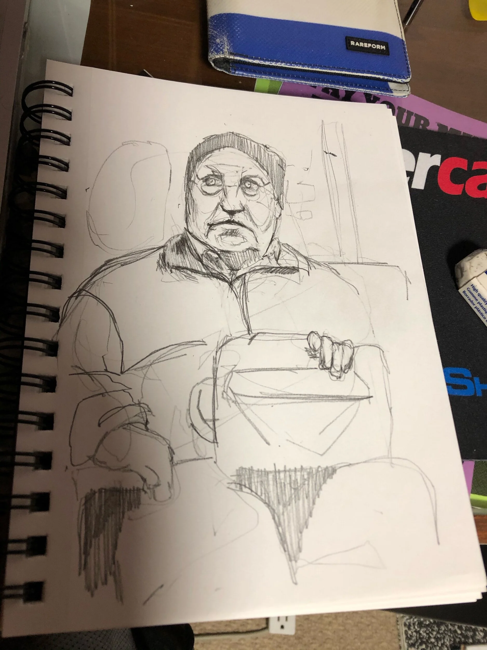
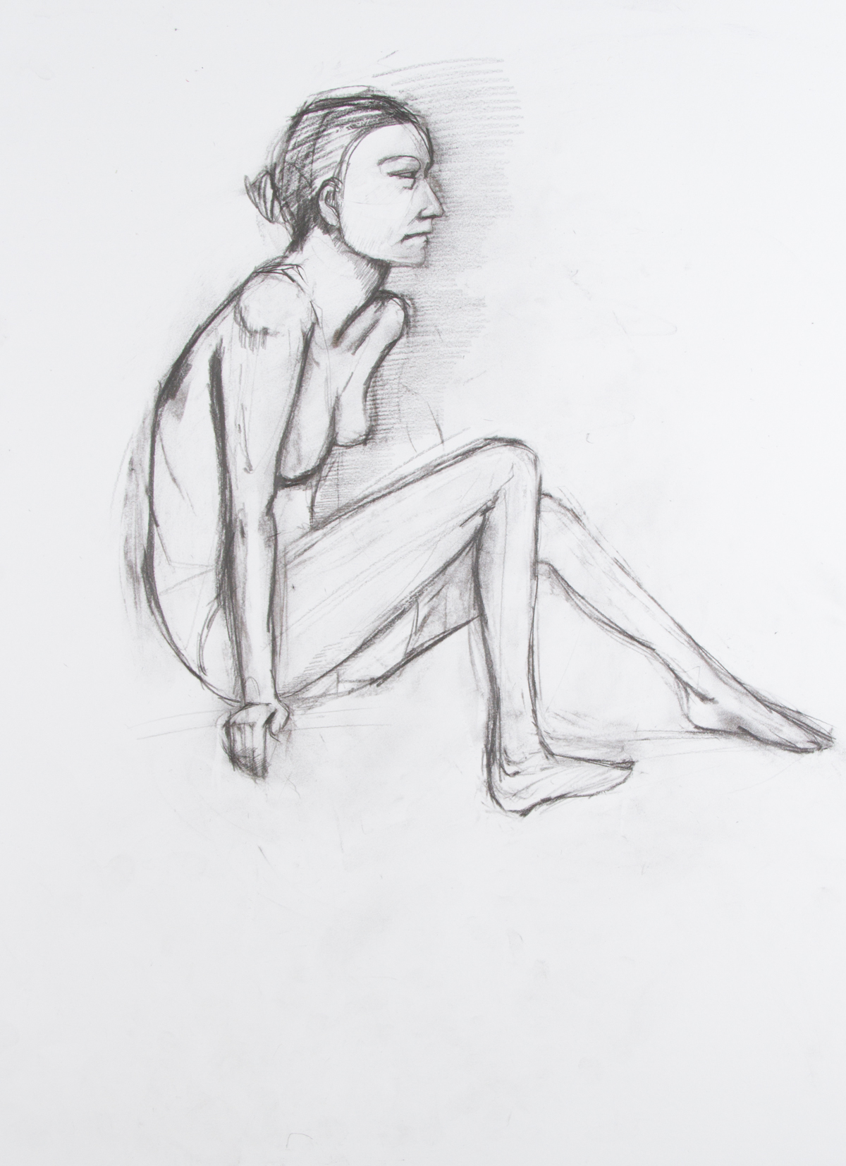
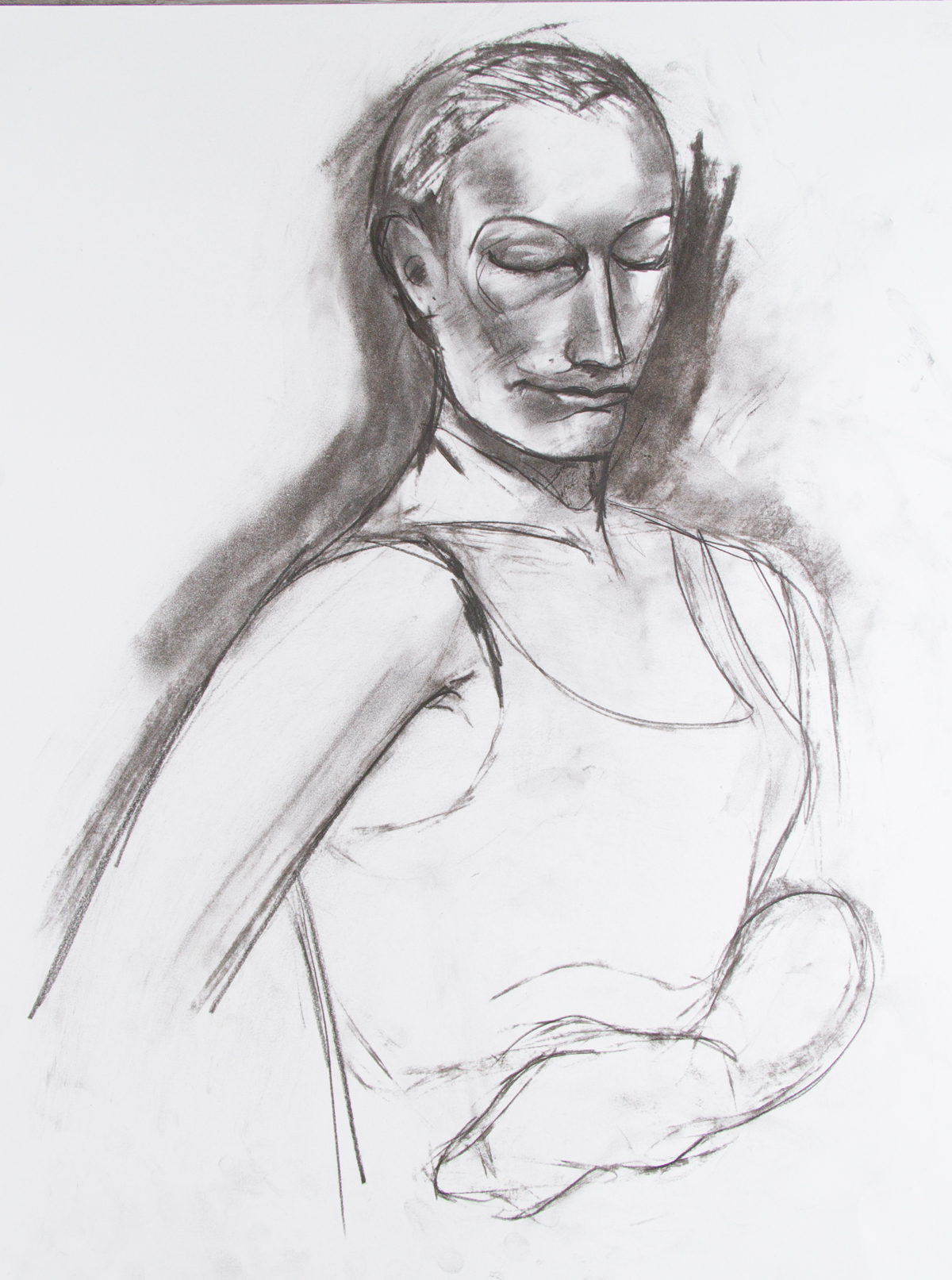
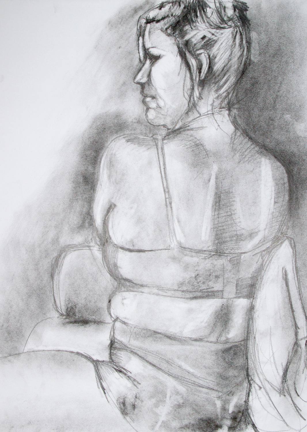
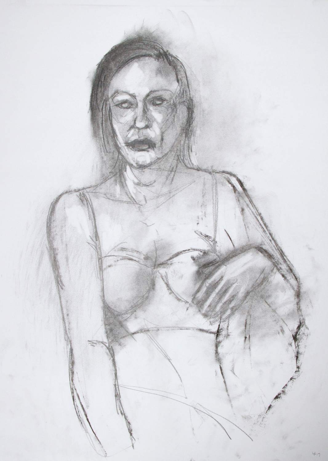
[.life.drawing.] [random.4.2016.]
I've been going to drawing regularly, and generally producing work I'm proud of, however I haven't completed much else... or so it seems at first glance... I mean- I have a few silkscreen projects slowly progressing, and photographing tons of abandoned school buildings, but not quite as much visible progress as I would like. I think for me the fact that all of my projects are still in progress, as opposed to completed, makes me feel like I haven't been working enough.
After mentioning the things I'm working on I suddenly feel like I'm busier. I need to try harder to appreciate the things i'm working on, as opposed to just the things i've completed.


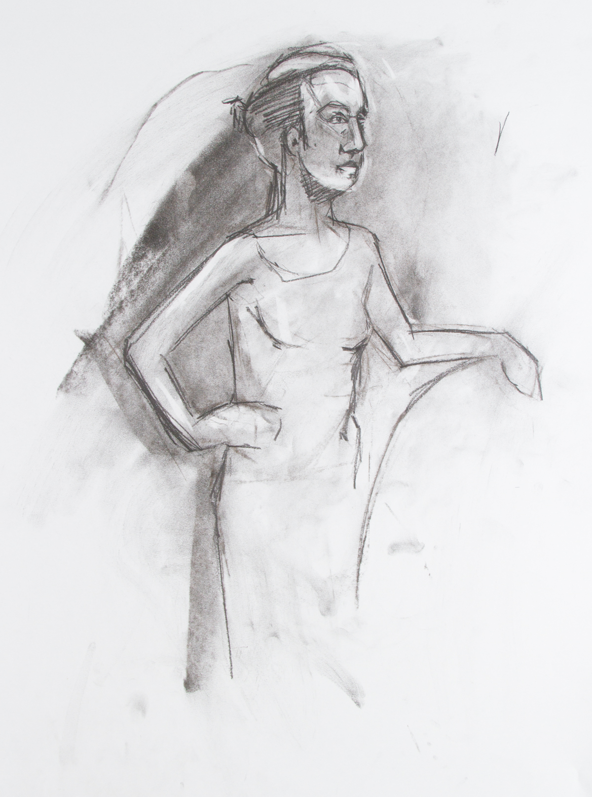
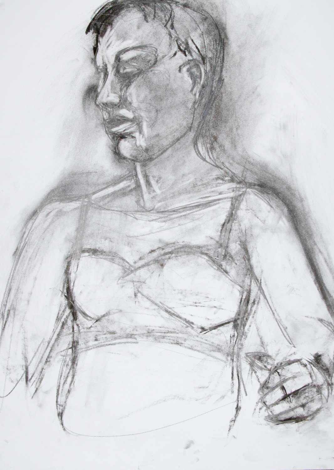
[.life.drawing.] [.4.18.16.]
[.LUSH.VIBES.][EXHIBTION]
I'm honored to be included in a recent exhibition in Brainerd, Minnesota.
"The Franklin Arts Center Resident Artists Gallery presents Lush Vibes, our 3rd Annual Spring Juried Exhibition. This year, we are excited to announce that Sam Bruno is our guest juror for this exhibition. This show will be on display in our gallery from late March through April. Gallery Hours are Wednesday - Saturday 10am-5pm. "
![IMG_0707[1].JPG](https://images.squarespace-cdn.com/content/v1/529b3a26e4b0a5b6da0800bb/1460162705193-GH68ZGCMM3DATQWVVRC9/IMG_0707%5B1%5D.JPG)
![IMG_0704[1].JPG](https://images.squarespace-cdn.com/content/v1/529b3a26e4b0a5b6da0800bb/1460162705288-SOZ8FAKK8YKKTJBD1R7T/IMG_0704%5B1%5D.JPG)
![IMG_0703[1].JPG](https://images.squarespace-cdn.com/content/v1/529b3a26e4b0a5b6da0800bb/1460162727812-9GF0F8A77YL2QMV3ENPZ/IMG_0703%5B1%5D.JPG)
![IMG_0692[1].JPG](https://images.squarespace-cdn.com/content/v1/529b3a26e4b0a5b6da0800bb/1460162727134-LTXR33MPZ30QGS2P0H83/IMG_0692%5B1%5D.JPG)
[abandoned.photography]
It's been a while since I've taken photos in an abandoned building but I recently got the itch to do some urban exploring. I did a bit of research online to find places and google earth to confirm where they are and currently have a long list of places I'd like to go to. On our first trip this weekend I took 64 GB of HDR photos and have begun processing them. They should be here soon.


Im hoping to plan another trip within the month.
[equipment.progress]
Im not sure why 3 bulbs have a bluer tone. They're all the same type, model, and brand of light.

Recharging
The weekend before last I had a chance to get to the Chicago Institute of Contemporary Art and see the Van Gogh Exhibition of his bedroom paintings. It was nice to see some art and recharge a bit. I absolutely love the Art Institute- I could have easily spent all day there, except for a brief bout of art-fatigue.

I was really reminded of my 20th Century art history classes and how much I enjoyed them.